PADI is the world’s top scuba diving certification agency, with more than 50 years of experience. One of the most recognizable parts of its identity is the PADI logo design. You’ll see it on dive center walls, websites, and certification cards around the world. Interestingly, one of the founders—not a professional designer—created the original logo. That early version even had a spelling mistake in the word “Professional.”
Designing a logo yourself can be exciting, but it often leads to problems later on. In PADI’s case, design choices made without expert help caused issues with visibility, scaling, and use across different media. These challenges still affect PADI and the dive centers that use its branding.
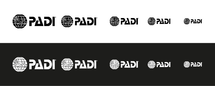
To find a solution to the scaling problem we put the PADI logo to the test. We printed and scaled down 4 versions of the horizontal logo, our conclusions can be found below.
The Original PADI Logo
Ralph Erickson, a PADI co-founder, designed the first logo. He wanted it to feel serious and trustworthy—like the National Geographic brand. The goal was to show values like exploration, professionalism, and accessibility. But since there was no formal design process, the final logo lacked contrast, flexibility, and readability. The famous spelling mistake was just one of several oversights.
PADI Logo Design Update
In the 1980s, PADI introduced the current globe & torchbearer emblem next to the word “PADI.” This gave the logo a more modern look. However, many of the same problems continued. The globe-and-diver image was hard to shrink down. In smaller sizes, the details disappeared. In some cases, designers removed the globe or made it much larger than the wordmark. Small updates—like gradients or size tweaks—have been made, but the logo hasn’t changed much since then. Compared to today’s clean, flexible logos, it feels a bit outdated.
Digital Era and Logo Refinements
In the 2000s, PADI adjusted the logo for better use online. The word “PADI” got bigger and was placed next to the globe to help with readability on websites and mobile devices. On top of that, a white background was added under the globe to improve sizing.
Even though the sizing problem did improve, the root of the problem, the inherited globe itself, did not.

Solving the Sizing Problem
Firstly, to keep things looking professional, dive centers should always use the original PADI logo found on the marketing section on their Pro site. A consistent look builds trust and helps people recognize the brand. With that said, let’s continue…
The first logo was probably made on white paper, which gave the initial globe contrast. To stay true to the original idea, we think it is best to use the color logo on white or even light-colored backgrounds, especially when printed. With the darker backgrounds thanks to the white reserve area around the globe, legibility has improved significantly, on both print and digital media, but especially on digital media.
The black & white versions of the logo clearly give the worst outcome, especially the black version on both print and digital media. Luckily this version is rarely used. The white version on the other hand does work magically on digital media.
The struggles with the PADI logo design show why it’s so important to work with design professionals from the start. This is especially true in scuba diving, where a dive center logo design has to work on many surfaces and in different sizes—often in challenging environments.

The story of PADI logo design is well known and offers many lessons. It started as a hand-drawn idea with a typo and became a symbol recognized around the world. Its journey shows why good branding matters. For dive centers, using the logo correctly and understanding its limits isn’t just about style—it’s about building long-term trust and being part of a strong, global brand.